| Author |
 Topic Search Topic Search  Topic Options Topic Options
|
Chovynz 
Senior Member


Joined: 07 March 2007
Location: New Zealand
Points: 547
|
 Post Options Post Options
") Thanks(0) Thanks(0)
 Quote Quote  Reply Reply
 Topic: What do you reckon? (feedback on design) Topic: What do you reckon? (feedback on design)
Posted: 24 September 2007 at 11:23pm |
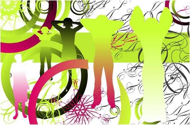
All comments welcome.
Edited by Chovynz
|
Defending the male species since 1980 
|
 |
|
Sponsored Links
|
|
|
caitlynsmygirl
Senior Member

Joined: 01 January 1900
Points: 8777
|
Post Options
Thanks(0)
Quote Reply
Posted: 24 September 2007 at 11:56pm |
well i dont know much about design myself but i do know what i like, and personally i really like that! i like the colours youve used and the kind of 60s/70s psychedelic (sp) feel to it,and i like the way they are standing-getting smaller then larger if you look one way but can also be getting larger then smaller if you look the other.
Probably not very useful feedback im afraid,as i said i dont know much about design, but i like it ! 
|
|
Chovynz
Senior Member
Joined: 07 March 2007
Location: New Zealand
Points: 547
|
Post Options
Thanks(0)
Quote Reply
Posted: 25 September 2007 at 12:14am |
 caitlynsmygirl wrote: caitlynsmygirl wrote:
well i dont know much about design myself but i do know what i like, and personally i really like that! i like the colours youve used and the kind of 60s/70s psychedelic (sp) feel to it,and i like the way they are standing-getting smaller then larger if you look one way but can also be getting larger then smaller if you look the other.
Probably not very useful feedback im afraid,as i said i dont know much about design, but i like it ! |
Allcomments welcome. Especially ones like those. Thanks.
|
Defending the male species since 1980
|
|
Faraway
Senior Member

Joined: 02 April 2007
Points: 824
|
Post Options
Thanks(0)
Quote Reply
Posted: 25 September 2007 at 7:08am |
|
Oooh what's it for? Reminds me of something I've seen somewhere (though not the SAME). I like!
|
|
|
|
my2angels
Senior Member

Joined: 01 January 1900
Points: 3943
|
Post Options
Thanks(0)
Quote Reply
Posted: 25 September 2007 at 7:10am |
|
I really like it although to be honest Im not really sure i like the closest siloutte shape....something odd about it but that could just be me. Theres a lot to look at and the colours are great... really interesting. Is it for anything in particular?
|
|
james
Senior Member

Joined: 01 January 1900
Location: New Zealand
Points: 7255
|
Post Options
Thanks(0)
Quote Reply
Posted: 25 September 2007 at 7:13am |
i like it i like the green but not the pink(not a pink fanlol) 
|
|
<a href="http://lilypie.com"><img src="http://b4.lilypie.com/nLJ5p13.png" alt="Lilypie 4th Birthday Ticker" border="0" /></a>
|
|
MummyFreckle
Senior Member
Joined: 08 February 2007
Location: Auckland
Points: 4120
|
Post Options
Thanks(0)
Quote Reply
Posted: 25 September 2007 at 9:57am |
Looks great - my only feedback would be about the 2 closest figures and their arms. I would put the "holes" in - if that makes sense - otherwise they look a bit like wings....
Also the figure in the bottom left looks a little out of place.
Otherwise - love the colours and the general "feel" of it.
Well done!
|
|
|
|
caliandjack
Senior Member

Joined: 10 March 2007
Location: West Auckland
Points: 12487
|
Post Options
Thanks(0)
Quote Reply
Posted: 25 September 2007 at 10:12am |
|
Agree with Caitlinsmygirl, very psychedlic 60s/70s esp with the lime green. I don't get the figure in the bottom left hand corner though? The first figure looks angelic is this what you intended? Whats is for?
|
  [/url] Angel June 2012
|
|
MILF
Senior Member

Joined: 01 January 1900
Location: Antarctica/Invercargill ;)
Points: 1988
|
Post Options
Thanks(0)
Quote Reply
Posted: 25 September 2007 at 10:52am |
when i first looked at it i thought it showed a progression from person to angel at the end - with the differences in the arms etc.... is that what you intended or am i reading WAY too much into it????
very cool, looks like a diet coke ad 
|
Lyla - mum to
Xanthe -  my big 4 year old 
and
Jordis - 1 year old 
|
|
kellverona
Senior Member
Joined: 01 January 1900
Location: Hervey Bay Australia
Points: 817
|
Post Options
Thanks(0)
Quote Reply
Posted: 25 September 2007 at 10:55am |
I really like it... The closest
figure looks like some type of angel maybe??
What is it for??
Your very talented...
|
|
|
|
kebakat
Senior Member
Joined: 01 January 1900
Location: Palmy North
Points: 10980
|
Post Options
Thanks(0)
Quote Reply
Posted: 25 September 2007 at 11:08am |
|
It looks cool but don't really like the front figure either.
|
|
baalamb
Senior Member
Joined: 01 January 1900
Points: 1820
|
Post Options
Thanks(0)
Quote Reply
Posted: 25 September 2007 at 11:29am |
MILF wrote:
when i first looked at it i thought it showed a progression from person to angel at the end - with the differences in the arms etc.... is that what you intended or am i reading WAY too much into it????
very cool, looks like a diet coke ad |
I thought the same it's neat.
|
|
fattartsrock
Senior Member

Joined: 01 January 1900
Points: 6441
|
Post Options
Thanks(0)
Quote Reply
Posted: 25 September 2007 at 11:44am |
|
|
|
The Honest Un PC Parent of 2, usually stuck in the naughty corner! :P
|
|
Chovynz
Senior Member
Joined: 07 March 2007
Location: New Zealand
Points: 547
|
Post Options
Thanks(0)
Quote Reply
Posted: 25 September 2007 at 7:40pm |
Aheh...Thanks all for the comments.
Faraway wrote:
Oooh what's it for? Reminds me of something I've seen somewhere (though not the SAME). I like! |
That's interesting that it reminds you of something. I'll tell you why at the bottom of this post.
my2angels wrote:
I really like it although to be honest Im not really sure i like the closest siloutte shape....something odd about it but that could just be me. Theres a lot to look at and the colours are great... really interesting. Is it for anything in particular? |
I'm think I don't like the closest silhouette as well. It's weird. Thanks about the lots to look at.
james wrote:
i like it i like the green but not the pink(not a pink fanlol) |
Lol fair enough.
SimSam wrote:
Looks great - my only feedback would be about the 2 closest figures and their arms. I would put the "holes" in - if that makes sense - otherwise they look a bit like wings....
Also the figure in the bottom left looks a little out of place.
Otherwise - love the colours and the general "feel" of it.
Well done! |
Cool, thanks for those comments. I did deliberately take out the holes but I don't think I got that shape right. My first intention was to make the silhouettes feel like they were changing from one thing to something else. Haha about that bottom left guy.
fleury wrote:
Agree with Caitlinsmygirl, very psychedlic 60s/70s esp with the lime green. I don't get the figure in the bottom left hand corner though? The first figure looks angelic is this what you intended? Whats is for? |
Thanks for that.
MILF wrote:
when i first looked at it i thought it showed a progression from person to angel at the end - with the differences in the arms etc.... is that what you intended or am i reading WAY too much into it????
very cool, looks like a diet coke ad |
fattartsrock wrote:
I thought the same as well. Looks like an Album cover. Very cool |
Heh.. way cool. Thanks.
Interesting thoughts there. Wow. thats high praise (Coke ad & Album cover) methinks. Thanks.
kellverona wrote:
I really like it... The closest figure looks like some type of angel maybe??
What is it for??
Your very talented...
|
Thank you.
kebakat wrote:
It looks cool but don't really like the front figure either. |
Me too! Thanks for commenting.
That was a very interesting exercise. Now to answer your questions. I made it...for no particular reason. I'm stressed at the moment and I was up way too late last night, doing that green/pink stuff when I should've been sleeping or doing the ACTUAL design work I was supposed to be doing. I saw something in a brochure I am doing for a client. I took that silhouette (which I also did ages ago for that guy) put some things around it, changed it and cut it up, added things, deleted things, did some random things, added those funky circles, cut them up, chucked some text around, deleted most of the text, move it this way, then that way, turned some things upside-down and back-to-front, pulled stuff to the front and moved others to the back, added colour, didn't like it, changed it some more, wiped all the colour out and only had one colour. I chopped up some "Edwardian" font letters (thats that twirly stuff) glued them together, made something completely not like a letter, twirled it around more, splattered them around, pushed and prodded, pulled and poked, turned and twisted until I could hardly keep my eyes open.
I had a feeling of "change" when I was making it, but I think now, I didn't get those two front people right. They looked weird when I posted it, and they still do.
Your guys comments about angel was interesting. I don't think that was my intent but I liked hearing what you thought of the pic without my interference. I think, once somebody mentions "angel", suddenly everyone starts to see it.
I was originally going to make an orange design but that never happened!!
Again thanks for all your comments. I appreciated all comments, and quoted ones who I wanted to bring a point out of.
If anyone wants to use this for anything feel free to PM me and I'll send you a better version. I scaled it down for the forum.
|
Defending the male species since 1980
|
|
caliandjack
Senior Member
Joined: 10 March 2007
Location: West Auckland
Points: 12487
|
Post Options
Thanks(0)
Quote Reply
Posted: 25 September 2007 at 8:50pm |
That's really cool. Can we have another one?
|
[/url] Angel June 2012
|
|
Chovynz
Senior Member
Joined: 07 March 2007
Location: New Zealand
Points: 547
|
Post Options
Thanks(0)
Quote Reply
Posted: 25 September 2007 at 10:52pm |
|
Sometime.
|
Defending the male species since 1980
|
|
my2angels
Senior Member
Joined: 01 January 1900
Points: 3943
|
Post Options
Thanks(0)
Quote Reply
Posted: 26 September 2007 at 7:23am |
|
I can see the gradual change in the people but the last one is too different from the previous like there are no legs AND arms are different where as the previous ones have only had one change made but thats probably just me being pedantic!
Glad you didnt go orange, i like the colours (and i hate orange)
|
|


")


 What do you reckon? (feedback on design)


